
A Beginners’ Guide to Profile Analysis: The Cornerstone of Energy Analytics for Building Performance
Share This Blog

Profile analysis was the first thing I learned as an energy analyst. It is the foundation of all other forms of energy analysis. Without an understanding of how buildings use energy on a half-hourly basis, everything else is just noise.
The mass adoption of smart metering and AMRs has meant that ‘energy profiles’ are widely available. Back in the day, they were recorded by an energy profiler that was temporarily installed for a couple of weeks. This meant analysts were dealing with a very limited time period for a limited number of data points. Thankfully, this is no longer the case.
A building’s energy profile is the shape drawn by the high-resolution data for a single day. It’s important to analyse profiles for longer periods of time but we’ll come onto that later.
Typically (and annoyingly) called a ‘top hat’ profile, the energy profile illustrates a building’s operational pattern. The non-energy related insights that business owners can observe from energy profiles is often surprising. Very little happens in a building without energy being consumed.
I’ve seen profiles that have highlighted early finishes on a Friday, ineffective store managers, unsanctioned overtime and links to financial performance. On occasions, it can get a bit ‘big-brother-esque’. A little unnerving? Perhaps. But it should at least demonstrate the full potential of simple electricity and gas data.
What is Profile Analysis?
In very basic terms, energy profile analysis is the process of assessing the shape of a building’s daily consumption profile with the intention of identifying abnormalities or opportunities to optimise performance. It can be inefficient for sure, and we’ll get onto more scalable ways of doing it later, but there’s no alternative to spending time understanding a building’s usage trends.
So what exactly are you supposed to be looking for? The first thing to do is to make an attempt at rationalising the energy profile within the context of business operation. In other words, try to explain trends using what events took place in the building at that time. This is an excellent way to engage non-energy people in the process before getting stuck into the detail.
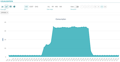
Let’s take the example of a commercial office building. Below is an example of a textbook profile. Every building will have a different profile but this is about as straightforward as it gets. Let’s break it down into its component parts.
Deconstructing an energy profile and what to look out for
Base-load or non-operational hours
This is the lowest consumption period of the day when the building is empty. You want this to be as low and as flat as possible. Compare it to operational or peak consumption. Is it as expected? Does it look as if things are running overnight unnecessarily?
What to look out for:
- Variation within a single day’s baseload indicates the heating or cooling system is running.
- Changes in temperature throughout the night cause the variation. Checking for seasonality will verify this.
- High but consistently flat loads that vary day to day suggest lighting is being left on.
Start up and shut down
These are identified by the sharp increases and decreases in usage as the demand for main building services rises and falls. They rarely follow the opening hours of a building but instead illustrate when people are actually in the building or when the main building services are scheduled to run.
What to look out for:
How many hours either side of the building’s operational hours does it take to start up and shut down? You’ll find time schedules have been set very conservatively to fit all needs. A partial start-up for a few hours as times building services run followed by another peak as people enter the building will help to identify this. The same logic can be applied to shut down.
Peak-load or operational hours
This is the chunk of consumption that relates to the main purpose of the building, whatever that may be. It’s often possible to detect lunch breaks in offices, busy periods in restaurants and maximum output in factories. With so much complexity, this can often be the most difficult section to deconstruct.
What to look out for:
The most obvious sign of waste during operational hours is a very flat load throughout the entire day (unless it’s clear why this would be expected). An efficient building will use demand-based control so that energy use fluctuates depending on the need.
However, it’s very common to find building services set to run flat out all day. This will be plain to see in the consumption profile. More generally, focus on finding the relationship (or lack of) between what goes on within the building and what the profile shows.
Profile Analysis at Scale
For many experienced analysts and data scientists, the idea of eyeballing energy profiles one by one will seem slightly insane. But the process will teach you about the intricacies and nuances of building optimisation that you’d miss by blindly applying an algorithm.
However, when you’re dealing with thousands of buildings and millions of lines of half-hourly data there comes a point where you must find a more time-effective way. Profile analysis can also be pretty subjective. What looks abnormal to some may go unnoticed by others.
Automated Profile Analysis
When you think about it, profile analysis comes down to making on the spot calculations based on the shape of an energy profile. So why not standardise and automate them?
You’ll probably look at the difference between baseload and operational load, how defined start and up and shut down is, or perhaps how much operational consumption varies throughout the day.
The idea is to create a number of metrics that suit your building type, or that focus on the trends you found analysing the profiles of a sample group.
Here’s a couple to get you started:
- Operational load / Base load
- Average annual baseload - minimum baseload in the year (baseload waste)
- Maximum incremental increase (startup) vs open time
- Maximum incremental decrease (shut down) vs close time
Heat Mapping
A heat map is a data visualisation technique that builds on the humble line chart by adding another dimension in the form of colour. The key benefit of illustrating energy data with a heat map is that a year’s worth of half-hourly data is easily digestible at a glance.
The structured format makes inconsistencies incredibly clear and pre-programmed time schedules are also highlighted very well.
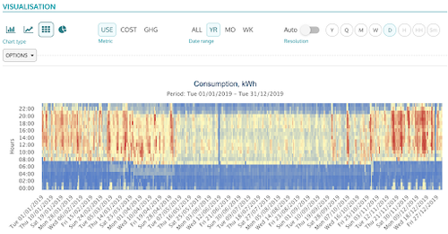
The example above highlights higher periods of consumption during core operational hours during December and a distinct period of lower consumption during the summer months. Think of each column as an independent profile.
The benefit of heat maps is we can now analyse how the profile has changed over time and identify if any trends exist on a weekly or monthly basis. Plus, data visualisation techniques like heat maps can be a lot more engaging than scrolling through hundreds of profiles one by one.