Linear Regression in EnergyDeck: how to make the most of it
Share This Blog

If you've been entering meter readings, you may have noticed a new tab in the Meter Details view (the view you get when clicking on any meter name in the Setup section) called Regression Analysis. This post provides a quick tour of the new functionality.
The Basics
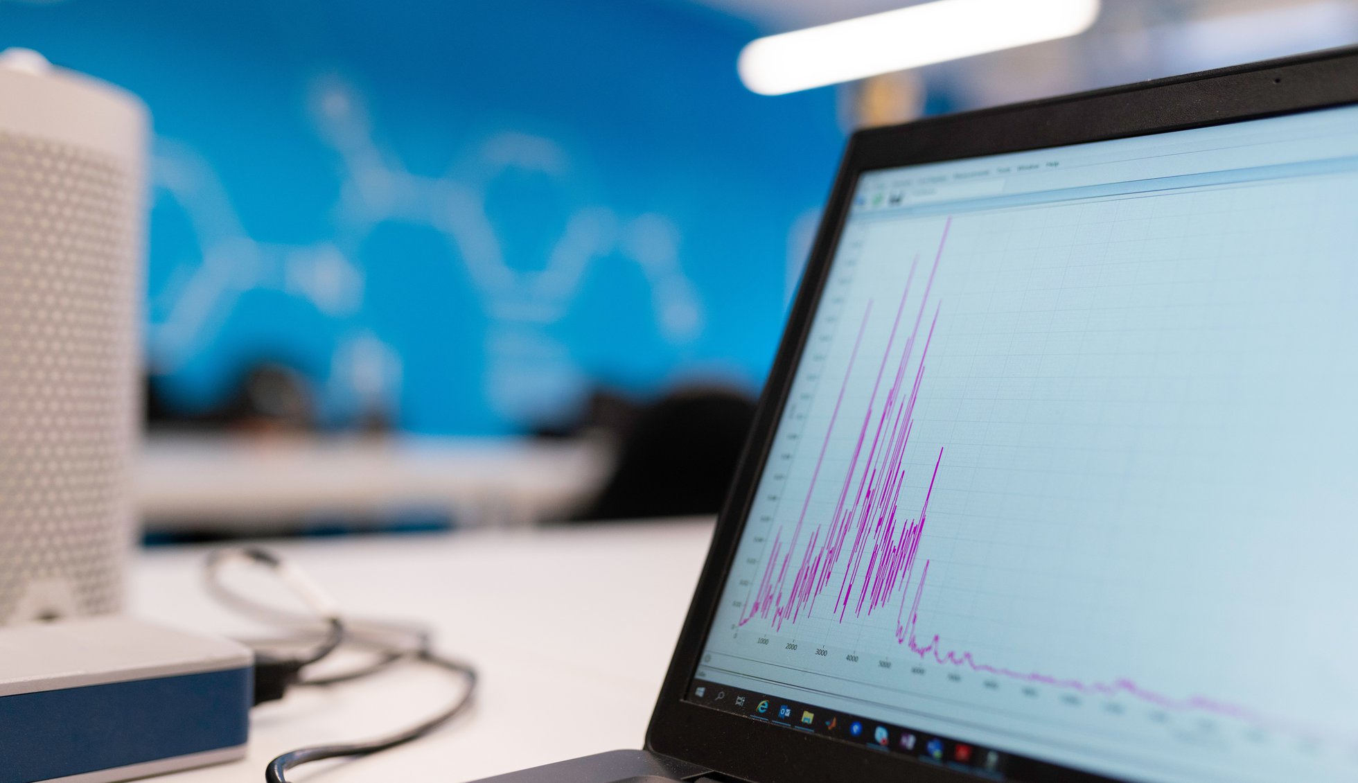
When you click on the Regression Analysis tab, you will see a graph called a fitted curve. By default, it is drawn against heating degree days (HDD) but you can draw it against cooling degree days (CDD) too. A fitted curve shows the result of a linear regression algorithm: simply put, the system has taken consumption data and HDD data and tried to identify a linear relationship between the two. The red dots are actual measured values while the blue line is the line the dots fit most closely to. The idea is that, if the consumption for this meter is driven by how cold the weather is, which is typical of gas consumption, then the data should closely fit the line.
The graph offers a quick view of the data but there are also important numbers at the top. Here is what they mean in reverse order:
- R2: this is a measure of how closely the data fits the line. The closer this value is to 1, the better the fit; the closer to 0, the worse the fit. At 0.66, it means that there is correlation between this meter's consumption and HDD data but it's not perfect.
- Base Load: this tells you how much is consumed against this meter on average when HDD is zero, or in other words what is the average load when the outside temperature is high enough that heating is not needed.
- kWh per HDD: this is how much more is consumed against this meter above the base load for every additional HDD.
- Base Temperature: this is the temperature below which heating is needed, in degrees celsius. EnergyDeck performs regression against a variety of temperatures and retains the one where the fit is highest. In this case, it means that on average, the building starts being heated when the temperature drops below 18°C. This is quite high: a normal base temperature for a building in the UK is considered to be 15.5°C, except for hospitals for which it is 18.5°C. A house insulated to Passive House standard could have a heating base temperature as low as 10°C.
The same metrics are available if you do regression against CDD but they are applied to cooling rather than heating so are relevant to a meter to which is connected a cooling system like air conditionning.
Residuals and Base Load
Two more graphs are available in addition to the fitted curve: residuals and base load. They are very similar and show two steps in the analysis of your data.
The residuals graph shows the regression residuals, that is the difference between actual data and the fitted curve. When there is strong correlation between the consumption data and HDD or CDD, this graph should be close to a horizontal line around the zero value. In this particular case, the various peaks in the middle of the graph and troughs at the extremes suggest that there are other parameters than the weather that drive the consumption on this meter.
The base load value given by the regression analysis is an average, so the last graph applies this average to the residuals to show how the base load varies over time.
In practice, this graph looks very similar to the residuals graph but with the deepest troughs shaved off. This highlights the two central peaks: one between mid-December to mid-February and the other one from March to May. Based on this graph, it looks like in cold weather, this office building is heated more than it needs to: could it be draughty by any chance?
Making the Most out of Regression Analysis
The data in the example above highlights the basic functionality behind this initial regression analysis implementation. However, the underlying data is test data that happens to be monthly bill data. Bill data is usually estimated rather than actual and monthly data is not very granular. The more data and the more granular that data is, the better regression analysis will work. Here are a few tips to get the most out of it:
- Use actual meter readings rather than bill data, either manual readings or automated,
- Ensure that your readings are taken at least once a week,
- Ensure you have one year worth of readings so that the analysis can cover a whole seasonal cycle; note that regression analysis will not be performed if you have less than 10 readings.
Next Steps
This first implementation of regression analysis is a first step in helping you understand your data better. There is a lot more we want to do so here is a short list of improvements to look out for in the next few months:
- Integration into the Trend Analysis graphs,
- Regression against other metrics than HDD and CDD,
- Multi-variate regression, that is the ability to perform regression against several metrics at the same time,
- Detection of outliers and behaviour change.